Toronto Review
BRAND IDENTITY, WEB DESIGN, MERCHANISE
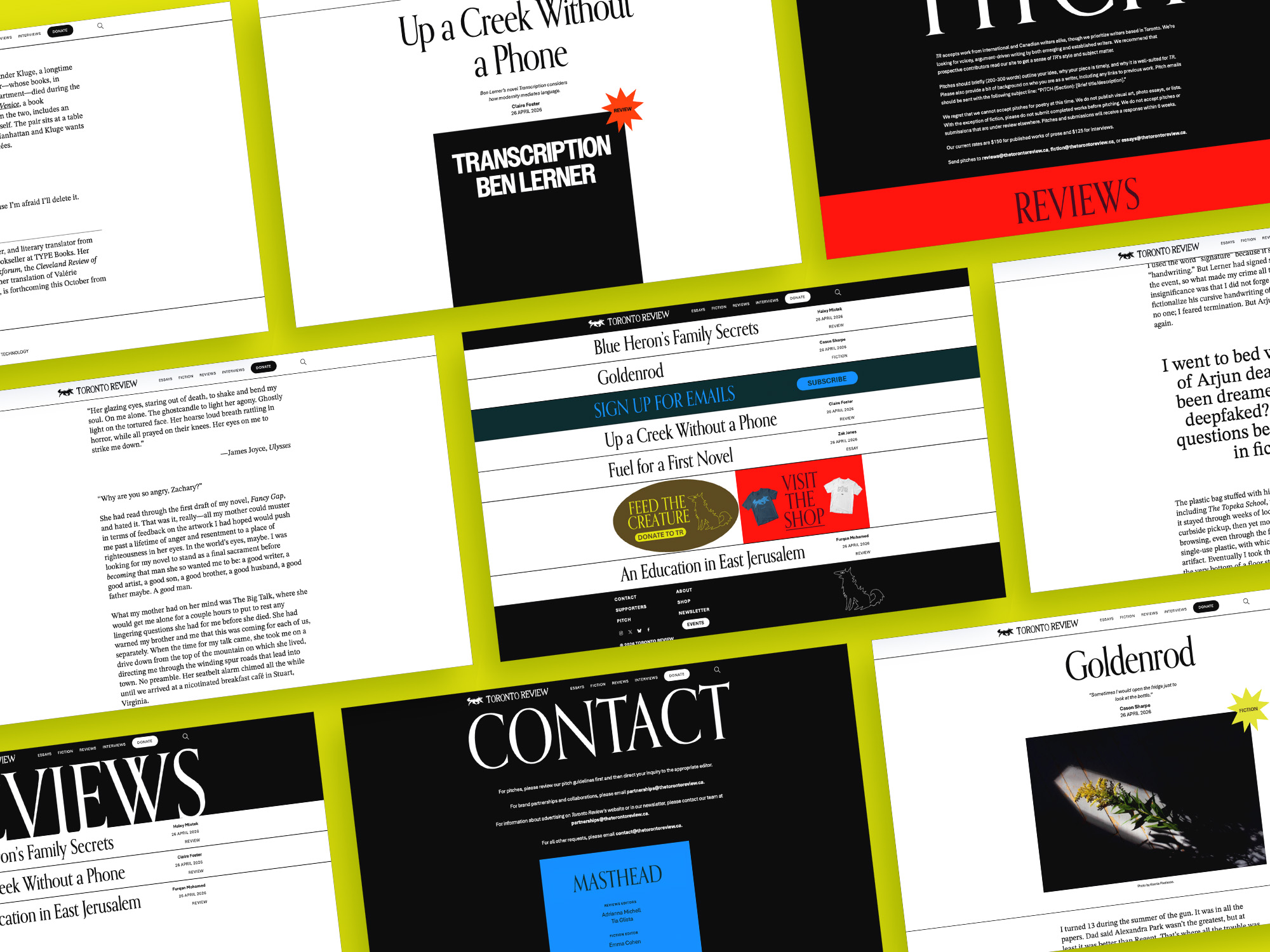
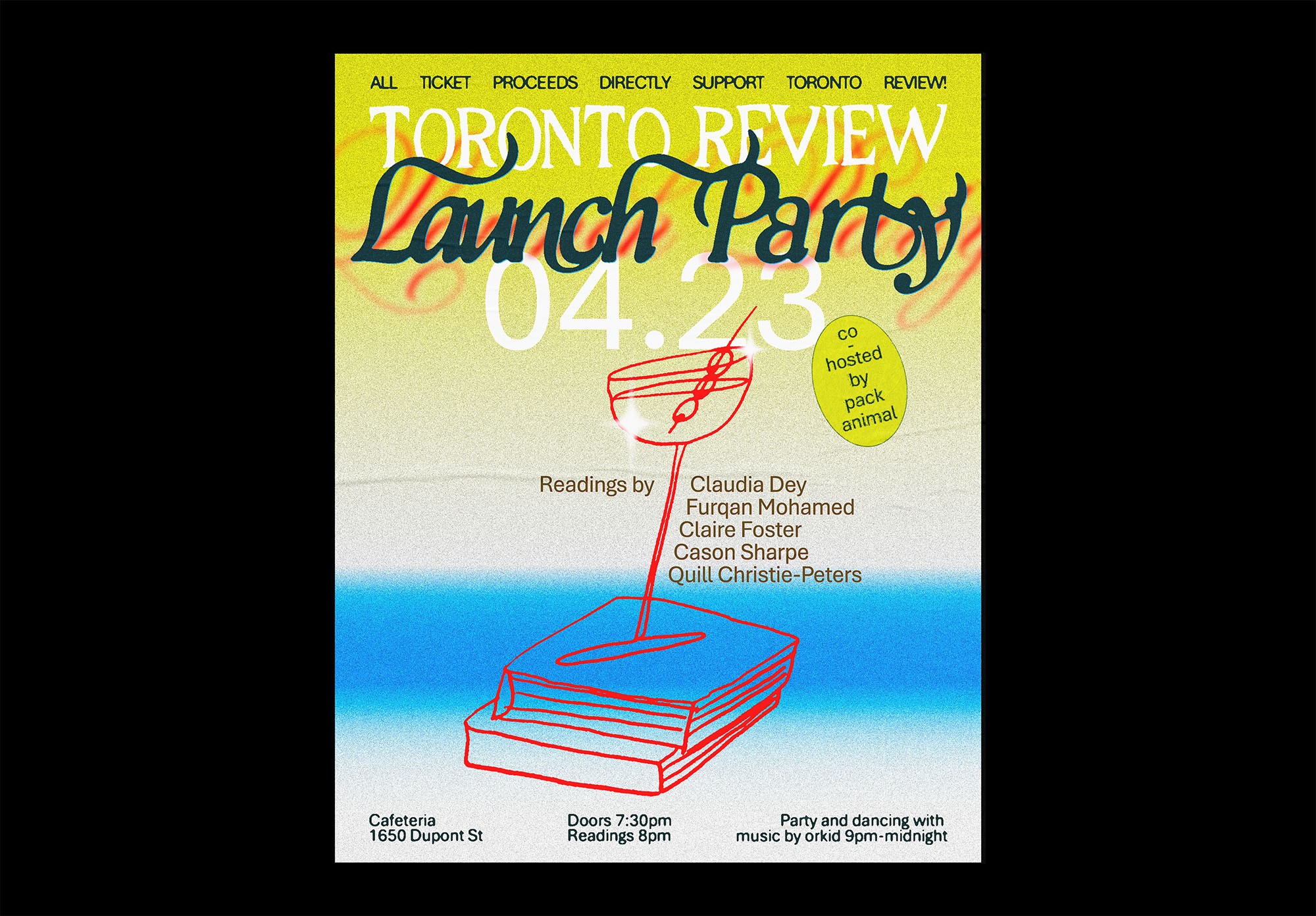
The Toronto Review is a magazine publishing innovative and tastemaking works of fiction and criticism in Canada. Launching in 2026, it needed a vibrant visual identity to span the scope of digital & print collateral.

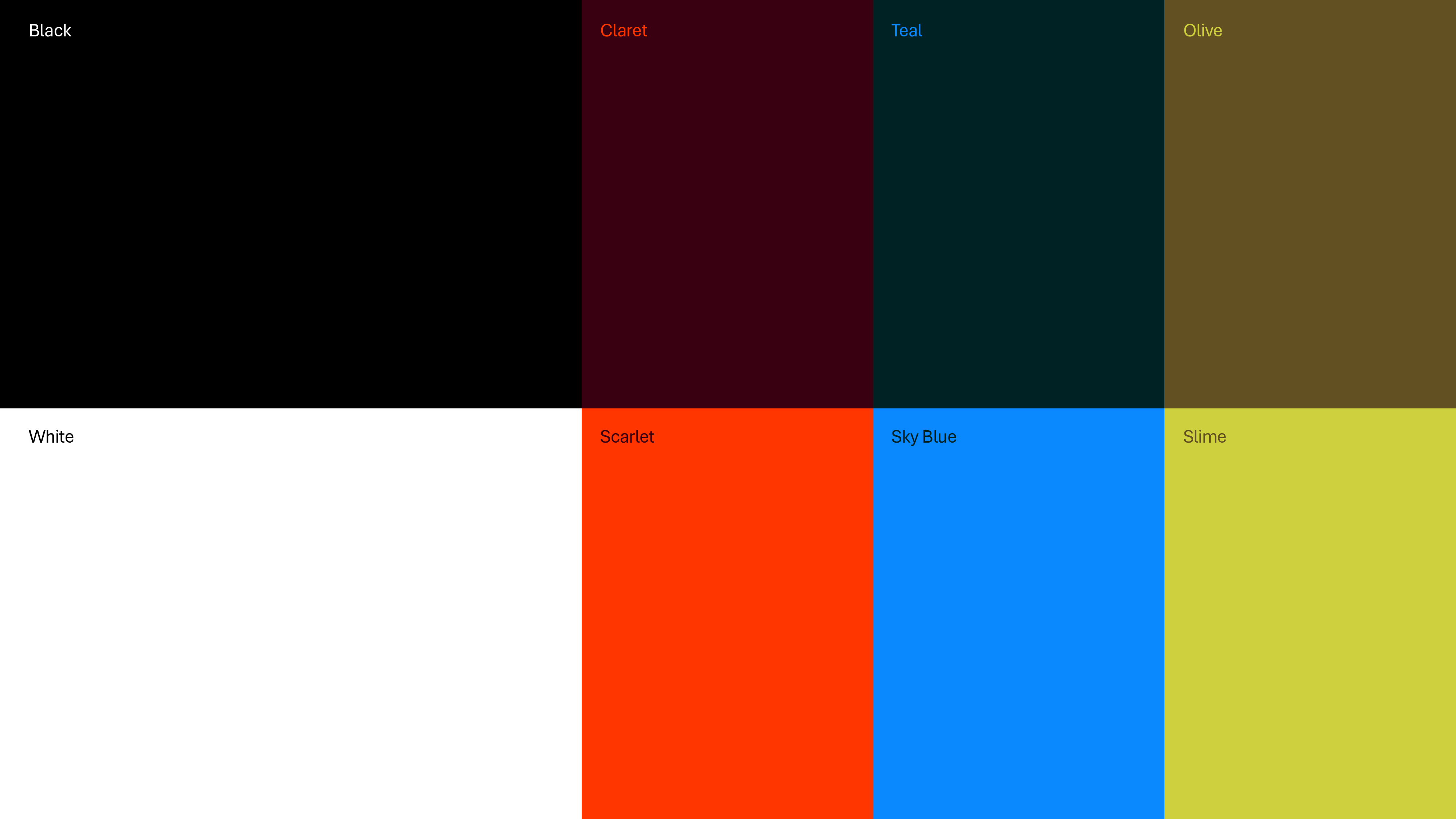
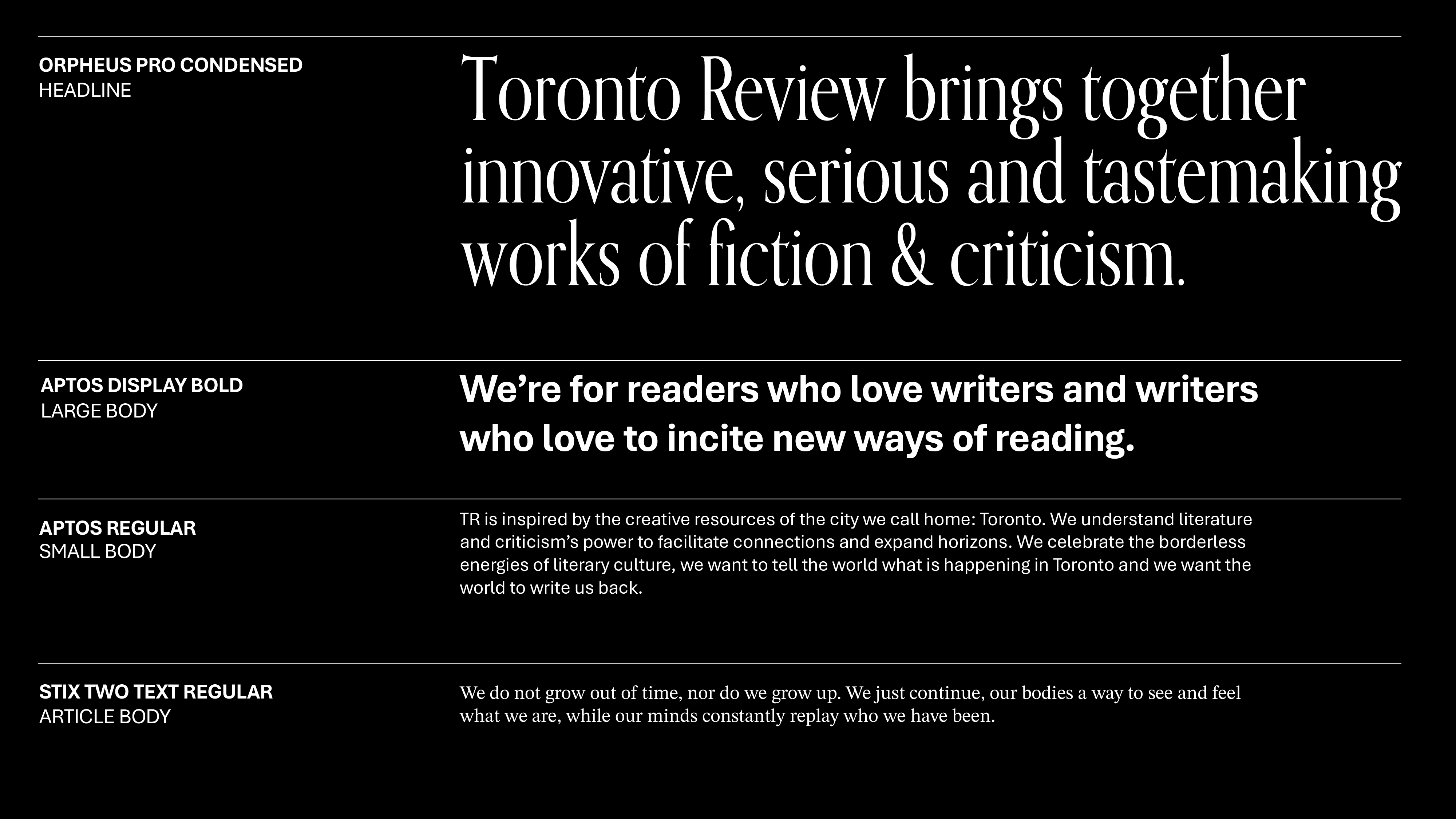
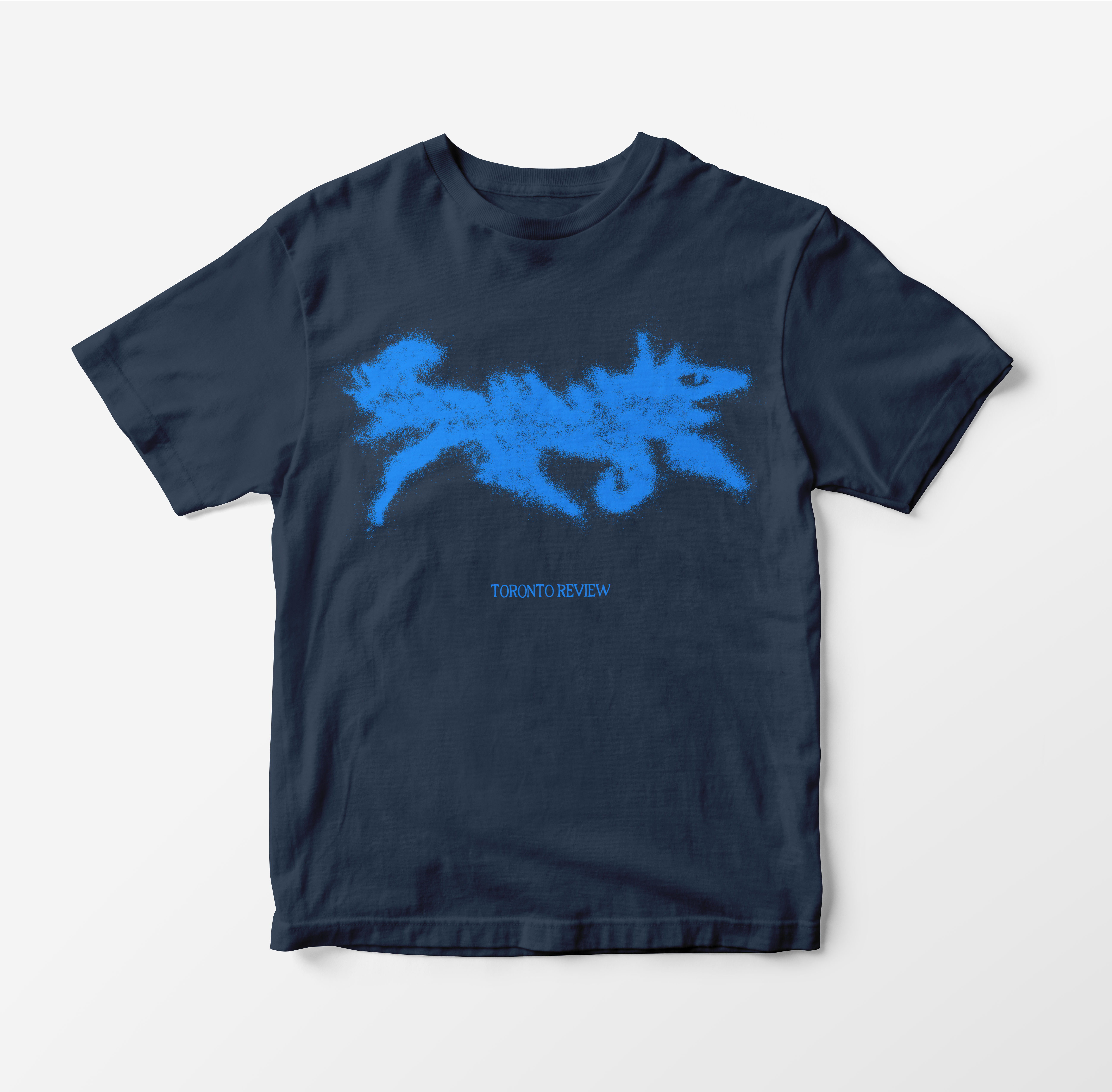
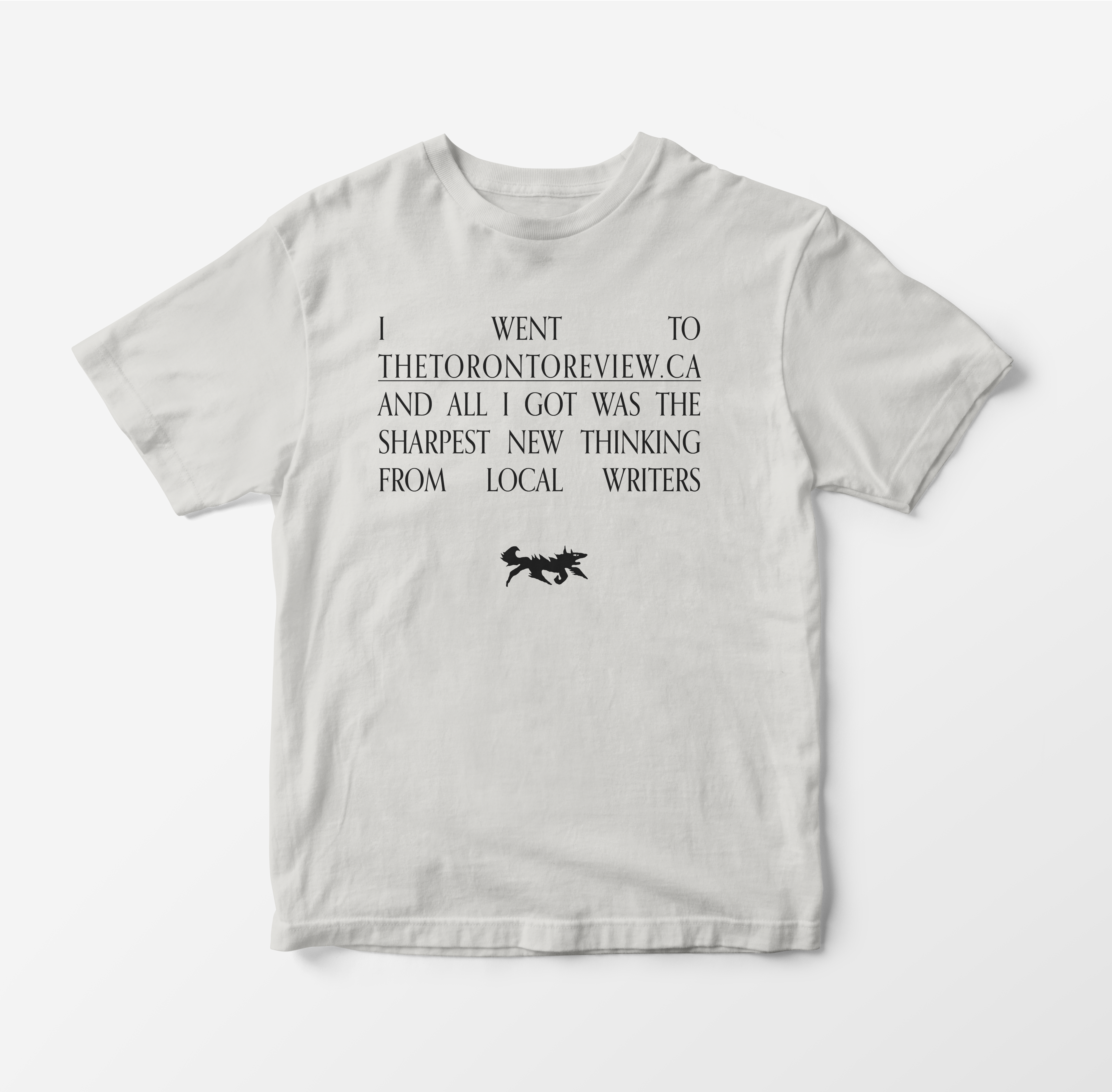
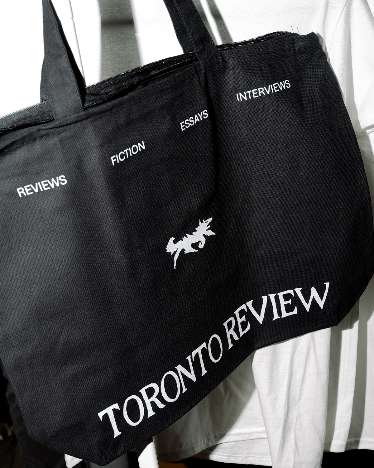
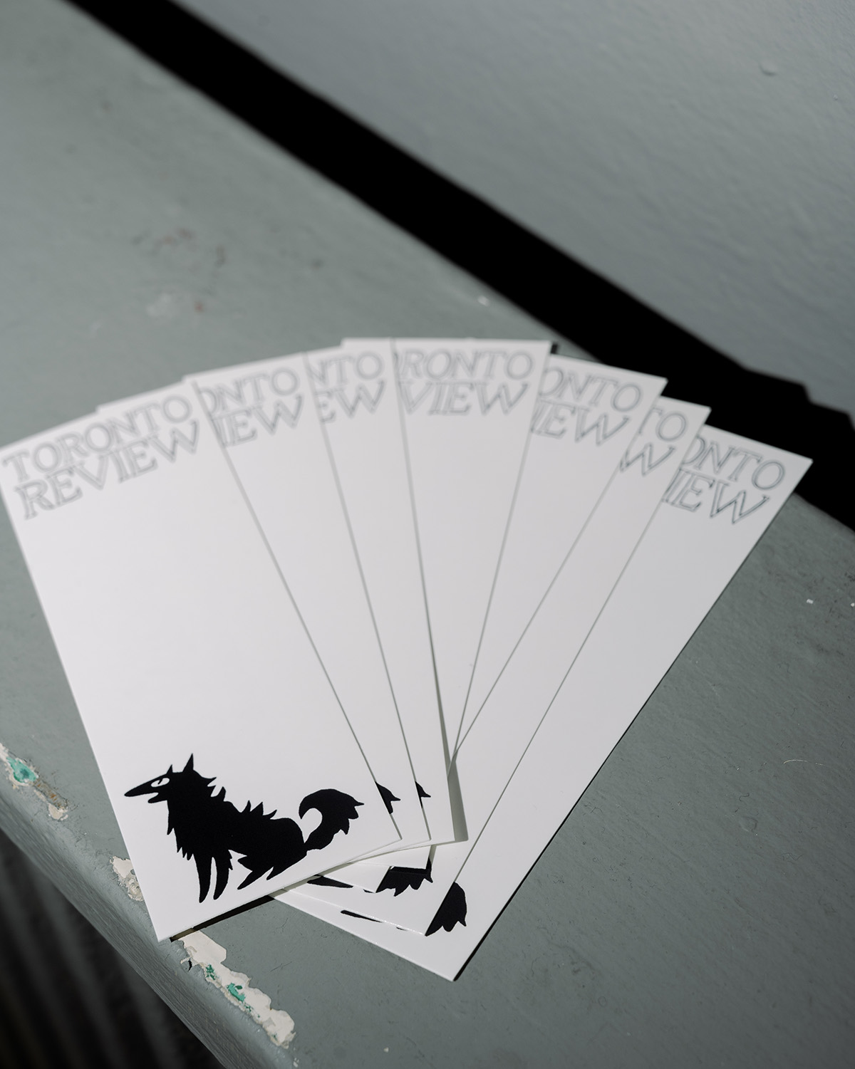
Our wordmark is inspired by the tombstone in Kurt Vonnegut's Slaughterhouse Five and the mischievous creature is inspired by medieval printer's marks, both placing TR in literary and publishing lineage.

Selected Works

Pack AnimalProject type
Craft PackagingProject type

Labatt OOHProject type
Misc DesignProject type

IllustrationIllustration
Plasma DolphinProject type